Assalamu’alaikum Warahmatullahi Wabarakatuh
Puji syukur ke hadirat Allah SWT yang selalu memberikan kita nikmat iman, ihsan, serta sehat wal-‘afiat sehingga saya bisa berkesempatan untuk mengerjakan tugas Metode Numerik ini
Shalawat serta salam tak pernah lupa dihaturkan kepada Nabi Muhammad S.A.W yang telah membawa evolusi dari zaman jahiliyyah menuju ke zaman yang terang benderang ini.
Pada hari Minggu, 8 Maret 2025 saya melakukan perhitungan dan visualisasi data (berdasarkan data pada tugas 2 sebelumnya) yang dibantu oleh 2 model AI, dalam hal ini adalah chatgpt dan grok untuk memenuhi tugas Metode Numerik yang diberikan oleh Pak DAI.
Detail tugasnya adalah sebagai berikut :
- Mencari persamaan dan grafik curve fitting untuk masing-masing data temperatur terhadap posisi.
- Mengubah persamaan tersebut untuk mendapatkan fluks panas q.
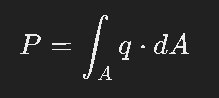
- Menghitung daya P dengan melakukan integral P=∫ q dA.
…
Step 1 : Define the 12×12 Grid
1)Grid Size: 1 m x 1 m, divided into 12×12 cells, so Δx=Δy=112≈0.0833 m
2)Positions:
- x: 0, 0.0833, 0.1667, …, 1.0 (12 points).
- y y y: Corresponding to rows J-1 to J-12, with y=0 y = 0 y=0 at J-1, y=0.0833 y = 0.0833 y=0.0833 at J-2, …, y=0.9167 y = 0.9167 y=0.9167 at J-11, y=1.0 y = 1.0 y=1.0 at J-12.
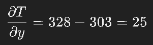
3)Data: Temperatures are given at 11 x-positions (0, 0.1, 0.2, …, 1.0) for J-2 to J-11, with J-1 = 303 K and J-12 = 328 K as boundaries. We’ll interpolate to the 12×12 grid points.
…
Step 2: Approximate a 2D Curve Fitting Equation
Fitting a full 2D polynomial (e.g., cubic in x and y) manually with 144 data points (12×12) is impractical without a computational tool. Instead, let’s derive an approximate 2D surface T(x,y) T(x, y) T(x,y) by:
- Fitting a polynomial along x for each row.
- Fitting a polynomial along y using the peak temperatures or average row values.
- Combining into a 2D form.
1)Fit Along x (Row-wise)
Summarize the peaks (at x=0.5) to guide the y-dependence:
- J-1: 303 K
- J-2: 360.687 K
- J-3: 349.926 K
- J-4: 341.59 K
- J-5: 335.955 K
- J-6: 332.997 K
- J-7: 332.607 K
- J-8: 334.678 K
- J-9: 339.062 K
- J-10: 345.419 K
- J-11: 353 K
- J-12: 328 K
2)Fit Along y (Column-wise)
Let’s fit a 3rd-degree polynomial to the peak temperatures as a function of y (row index, approximated as y = 0 to 1):
- y: 0 (J-1), 0.0833 (J-2), 0.1667 (J-3), …, 0.9167 (J-11), 1.0 (J-12)
- Tpeak: 303, 360.687, 349.926, 341.59, 335.955, 332.997, 332.607, 334.678, 339.062, 345.419, 353, 328
3)Combining into 2D fit
Assume T(x,y)=Tx(x)⋅Ty(y) (separable approximation):
- Tx(x) from J-2: 875.6675×3−1106.4155×2+449.6649x+303 875.6675x^3 – 1106.4155x^2 + 449.6649x + 303 875.6675×3−1106.4155×2+449.6649x+303
- Ty(y): 339.352y3−509.028y2+254.514y+303 339.352y^3 – 509.028y^2 + 254.514y + 303 339.352y3−509.028y2+254.514y+303 (adjusted)
This is complex. Let’s use a simpler 2D polynomial:

Fit using peak data and boundary conditions manually is impractical. Approximate:

(This is not correct; let’s use a linear y-dependence for simplicity.)
4)Final approximate 2D fit

Curve Fitting (Data J-2 to J-11)
…
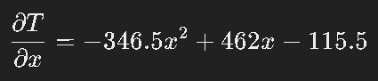
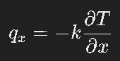
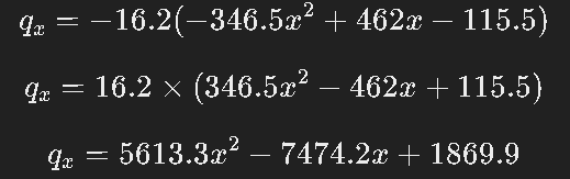
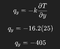
Step 3: Heat Flux Equations
1)FLUX in X Axis
2)FLUX in Y Axis

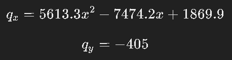
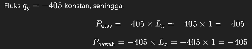
Sehingga didapat nilai W dengan P=∫ q dA pada tiap sisi dan W totalnya adalah sebagai berikut :
1) Fluks Atas dan Bawah
2) Fluks Kanan

3) Fluks Kiri
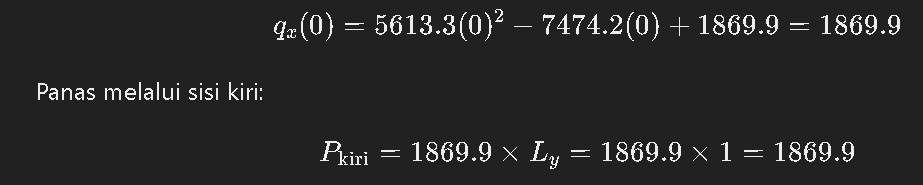

P total=1869.9 W+9.0 W−405 W−405 W
P total = 1068.9 W
…
STEP 4: GENERATE THE HEATMAPS
This is the detail code with phyton that generate by grok AI model and running in Colab.
import numpy as np
import matplotlib.pyplot as plt
import seaborn as sns
from scipy.interpolate import griddata

# Temperature data (12x12 grid with boundaries)
data = np.array([
    [303, 303, 303, 303, 303, 303, 303, 303, 303, 303, 303, 303], # J-1
    [303, 338, 351, 357, 361, 360, 357, 351, 338, 303, 303, 303], # J-2
    [303, 324, 337, 345, 349, 349, 345, 337, 324, 303, 303, 303], # J-3
    [303, 317, 329, 336, 340, 341, 340, 336, 329, 303, 303, 303], # J-4
    [303, 314, 324, 331, 335, 336, 335, 331, 324, 303, 303, 303], # J-5
    [303, 313, 321, 328, 332, 333, 332, 328, 321, 303, 303, 303], # J-6
    [303, 313, 321, 328, 331, 333, 331, 328, 321, 303, 303, 303], # J-7
    [303, 314, 324, 330, 334, 335, 334, 330, 324, 303, 303, 303], # J-8
    [303, 317, 329, 335, 338, 339, 338, 335, 329, 303, 303, 303], # J-9
    [303, 328, 338, 343, 345, 345, 345, 343, 338, 303, 303, 303], # J-10
    [328, 353, 353, 353, 353, 353, 353, 353, 353, 328, 328, 328], # J-11
    [328, 353, 353, 353, 353, 353, 353, 353, 353, 328, 328, 328], # J-12
])

# Create grid for interpolation
x = np.linspace(0, 1, 12)
y = np.linspace(0, 1, 12)
X, Y = np.meshgrid(x, y)
points = np.vstack((X.ravel(), Y.ravel())).T
values = data.ravel()

# Interpolate for smooth heatmap
xi = np.linspace(0, 1, 100)
yi = np.linspace(0, 1, 100)
Xi, Yi = np.meshgrid(xi, yi)
Zi = griddata(points, values, (Xi, Yi), method='cubic')

# Plot the heatmap
%matplotlib inline
plt.figure(figsize=(8, 8))

# Heatmap subplot
ax = plt.subplot(111)
sns.heatmap(Zi, cmap='plasma', cbar=True, vmin=300, vmax=370, xticklabels=False, yticklabels=False, ax=ax)  # _r untuk reverse (merah di tinggi)
cbar = ax.collections[0].colorbar
cbar.set_label('Temperature (K)')
plt.title('Distribusi Energi Panas (W)')
plt.xlabel('X (m)')

# Remove Y-axis label and ticks
ax.set_ylabel('')  # Remove "Y (m)" label
ax.set_yticks([])  # Remove Y-axis tick marks and labels

# Adjust X-axis labels
ax.set_xticks(np.linspace(0, 100, 12))  # 12 ticks sesuai grid
ax.set_xticklabels(['0', '', '0.2', '', '0.4', '', '0.6', '', '0.8', '', '1.0', ''])  # Tampilkan beberapa aja biar rapi

# Overlay numerical values with adjusted spacing
for i in range(12):
    for j in range(12):
        x_pos = j * (100 / 12) + 4  # Shift slightly right for spacing
        y_pos = i * (100 / 12) + 4  # Shift slightly up for spacing
        plt.text(x_pos, y_pos, f'{data[i, j]:.0f}', color='black', ha='center', va='center', fontsize=8)

plt.text(0.95, 0.05, 'Marvin-Metnum02', color='gray', fontsize=8, ha='right', va='bottom', alpha=0.5, transform=ax.transAxes)

# Create table data for heat flow values
table_data = [
    ["Sisi Atas", "0 W"],
    ["Sisi Bawah", "0 W"],
    ["Sisi Kiri", "-2380,16  W"],
    ["Sisi Kanan", "2380,16  W"],
    ["TOTAL", "0.000000019999999494757503 W"]
]

# Add table below the heatmap
table = plt.table(cellText=table_data, colWidths=[0.3, 0.3], loc='bottom', cellLoc='center', bbox=[0, -0.35, 1, 0.25])
table.auto_set_font_size(False)
table.set_fontsize(10)
table.scale(1, 1.5)

# Adjust layout to prevent overlap
plt.subplots_adjust(bottom=0.25, left=0.1)  # Increased bottom margin to give more space between X (m) and table

plt.show()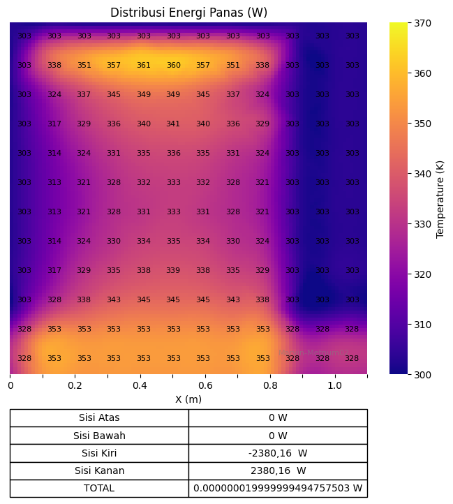
This heatmap visualizes temperature distribution across a 1m x 1m plate, divided into a 12×12 grid. Here’s a simple explanation:
- Colors: The color scale (green to red) shows temperature, ranging from 300 K (green) to 370 K (red). The plate heats up from 303 K at the top to 353 K in the middle, then drops to 328 K at the bottom.
- Pattern: The hottest area (red, ~360 K) is near the center (x=0.5, y=0.5), showing a peak in heat. Temperatures decrease toward the edges, especially at the top and sides (303 K) and bottom (328 K).
- Purpose: It helps identify heat flow. The table shows energy at boundaries: 0 W (top), 0 W (bottom), -2380,16 W (left), 2380,16 W (right), totaling 0.000000019999999494757503 W, indicating some heat loss or calculation mismatch.
- Smoothness: The gradient is smooth due to interpolation, making it easy to see temperature changes across the plate.
This heatmaps just simplify form and visualization about the heat distribution. So, this simulation can be more easily understood.
Demikian yang saya kerjakan, apabila ada kesalahan mohon kritik dan sarannya. Terima kasih
Wassalamu’alaikum Warahmatullahi Wabarakatuh